Is your Website Responsive?
Responsive web design is an approach for developing websites that is functional on a multitude of screen resolutions like mobile devices, tablets, and desktop screens.
Benefits of Responsive Web Design :
- A single website to build, maintain and promote.
- Support for a variety of screen sizes.
- Future-friendly, because the layout will reflow based on screen size and not just the size of today’s popular devices.
- The URL structure remains constant for all devices. With Responsive design, you’ve one URL that is easy to update and optimize your content which in turn optimizes your content for all devices. Thus, improves your SEO.
- With the increase in viewers count, the business increases.
- Cost Effective. As server side maintenance is reduced. Clients can see different versions of the same content updated & maintained server side.
- Seamless User Experience.
Challenges With Responsive Web Design :
- Content meant only for large-screen devices is often delivered to small screens and simply “turned off” with CSS media queries, creating unnecessary downloads.
- Because the markup is a “one-size-fits-all” solution, we are unable to change the source order of that markup based on the device or screen size.
Solution to the above mentioned challenges is given by the Mobile First approach which is described next.
The MOBILE FIRST Approach
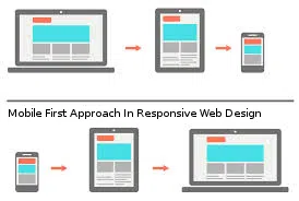
It can be challenging to clone a multi-column layout into smaller screen space, instead it’s much better to start simple & then work upwards to more complex designs. Here comes the Mobile First approach wherein the idea of designing the Smartphone experience comes first & then developing the design for tablets, desktops & possibly beyond.

The “Mobile-First” approach to responsive web design is not a new idea but is still an important one, it is helpful in addressing one of the shortcomings that we mentioned earlier – the problem of delivering unnecessary content. The Mobile-First approach meant that there is nothing to worry about delivering large amounts of content in the markup only to have to hide it visually with CSS. This also meant that images would be delivered only to devices they are intended for. For instance, a background graphic whose image is quite large, is intended to be a part of the design only on large screens.
Why MOBILE FIRST?
Because the use of mobile devices to surf the web is growing at an astronomical pace, but unfortunately much of the web isn’t optimized for those mobile devices.
Facts First :
- There are 1.2 billion (and counting) mobile users worldwide
- There are more mobile devices sold and activated than babies born, per day
- More people in Africa access the internet via a mobile device than via a PC or laptop
- 25% of mobile users in the US only use their smart phones to access the internet – not once using a desktop or laptop to go online
- Let’s face it: the world is gravitating towards mobile and there’s nothing designers or developers can do to stop it.
Most smartphone and mobile device users will be accessing the internet with a 3G connection or via a wireless hotspot with a lot of other users. Browsing the web on a smartphone is generally a slower experience than via a solid connection at home or in an office on a laptop or desktop PC. A simple, fast website will be a huge relief to mobile users and they’ll remember any website that provides them with that experience.
- Fluid Grids
- Fluid Images
- Media Queries
Fluid Grids
A website might appear in a large format like on a Desktop/Laptop, or on a very small screen like a Smartphone. For this reason, responsive websites are built with relative units like percentages, rather than fixed units like pixels.
Fluid Images
One should ensure that the image is never stretched or pixilated. That is, if they’re nested inside a parent container that’s smaller than their pixel value, then the image should shrink.
Media Queries
Media queries are CSS technologies that allow CSS to only be applied when specific conditions are met. For example, you could write a media query that will only apply CSS if the browser reaches a specific width.
Anblicks’s Expertise
Anblicks’s expert tech team can help your business in developing a mobile-compatible responsive website, portal, and product. As a result, good customer engagement and more sales.
To understand more about our offerings and the projects we have done before, please fill-up the contact us form, and our proficient team will connect you shortly.
“Be Responsive…!!”

Anblicks is a Data and AI company, specializing in data modernization and transformation, that helps organizations across industries make decisions better, faster, and at scale.


